Exactly matey, not sure why peeps can’t believe this songs not included..... for pinball. I would have been extremely surprised if it was for the very reasons you pointed out.Not too bothered about Stairway because it's too long and starts too slow.
Pinball info
You are using an out of date browser. It may not display this or other websites correctly.
You should upgrade or use an alternative browser.
You should upgrade or use an alternative browser.
Stern Led Zeppelin
- Thread starter Jsyjamie
- Start date
Anyone else notice that all 3 versions have the back box art from the side almost wrap around, continue art to the front translite?
Is this the 1st time Stern have done this?
Is this the 1st time Stern have done this?
Take a look at ACDC top down to the TNT targets. Look at the left side on Star Trek, where the warp ramp was is now that lane with the target (both Ritchie designs), the 2 targets are now 3 targets and the small return dead end lane on the left is the same. The right ramp on acdc has been replaced by the munsters alleyoop ramp. Center is the iron man monger. Some work around the top left.
I stand by my previous comment that Steve may be the king of flow but he is also the king of recycling designs. Artwork is horrible on all versions. I have the greatest hits album with the crop cicrcles and that would have made better cabinet art.
I stand by my previous comment that Steve may be the king of flow but he is also the king of recycling designs. Artwork is horrible on all versions. I have the greatest hits album with the crop cicrcles and that would have made better cabinet art.
Led Zep are my favourite band so I was looking forward to seeing what they made - mixed thoughts:
* Good choice of songs... missing out Stairway? Well... I dunno, it's the most known but probably doesn't fit so well so fair enough.
* The artwork was also going to be the biggest issue as LZ didn't go for commercial themed marketing like later modern bands... there was never any issue of finding artwork for Aerosmith, IM or GNR, but what could they pick for LZ other than album covers, band photos and "ZOSO" - slim pickings unfortunately
* I like the Pro artwork - worst album, but decent artwork, I think it looks good - don't like how the backglasses are all so similar to the cabinets, but again it's partly down to lack of choice
* Prem - well it's the iconic cover (grainy image and all), but backglass and cab the same? How easy is it to replace a Stern backglass image?
* LE - shocking. As has already been said, why not Mothership which has beautiful artwork (and colours). That LE is just fugly, it's like someone said "how can we appeal to kids too? Oh lets add some bright blue trim"... that Icarus logo isn't even LZ really, it was just their post-prime record label. Terrible choice. I think that Icarus stuff is v popular in USA though for some reason, probably the tasteless gareish colours?
* Like the blade lights. Blimp is quite nice but surely could have been a bit more textured? "ZOSO" side armour is very nice, looks great on the Prem. Topper quite nice but how much? Plunger add-on is meh. Jumping Icarus is crap.
* Playfield... don't know enough about Sterns to know how different it is but seems interesting enough... middle magnet looks good, is that copied from anything else?
I think I'd consider buying a Prem with side armour (+ topper if cheap enough, unlikely tho that is)... do Stern release separate UK versions later or does it require someone to import and adapt the US models? And how long to wait?
@MarkS - you should contact @philpalmer www.pinball.co.uk to arrange your Premium. The topper and side armour will not need to be adapted as the power into the machine is adapted on the line, then the topper will tap into the main CPU board in the game.
Topper will be $1,000 + shipping, import charges to UK - so all told, a little over £1,000 more than likely.
Topper will be $1,000 + shipping, import charges to UK - so all told, a little over £1,000 more than likely.
Has anybody else woke up with "Immigrant Song" stuck in their head today 
Has anybody else woke up with "Immigrant Song" stuck in their head today
I woke up with an Appetite for Destruction, but that's just a normal day for me
The illuminated side blades look like they should have been stranger things le features. Change to coloured fairy light style and bingo..Well after listening to Garry waffle on for an hour and nearly having a heart attack about someone leaking footage what can I say other than pants
Art rubbish
Playfield rubbish back to the old photo shop the only thing I liked was the illuminated side blades on the le and premium one positive if you bought a pro they do the art blades as a accessory
Nice to see them already launching the accessories already but you know it Neil that topper is going to be 1k
Best post so far.Considering Mr R has been working on this for well over 12 months, I think he has been watching youtube videos or porn for most of that time.
a rising spinner ffs??? Yawn....
* LE - shocking. As has already been said, why not Mothership which has beautiful artwork (and colours). That LE is just fugly, it's like someone said "how can we appeal to kids too? Oh lets add some bright blue trim"... that Icarus logo isn't even LZ really, it was just their post-prime record label. Terrible choice. I think that Icarus stuff is v popular in USA though for some reason, probably the tasteless gareish colours?
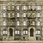
Physical Graffiti could have been an interesting choice too, especially if they decided to use it in the backglass and have the letters lighting up various features... but then I suppose they didn't have any precedent for that and couldn't re-use stuff from the parts bin.
man the attitude on this thread is ****ing depressing, none of you asshats have played this game yet its DOA. holy ****.
I get what you're saying but what you're reading here is big disappointment from people, that's all.
I was excited waiting for this reveal. I am a huge Stern fan and they've put out some great pins. I had thought they would raise the bar further with this one to compete with GNR.
They haven't. This pin might well turn out to be a blast to play - I certainly hope so. It would be nice to keep "The King of Flow's" reputation intact too. But the pin isn't exactly "loaded", and worst of all, it's butt-ugly. Everybody says so.
People hoped/expected to see something special, they didn't.
Good, bad or ugly I am glad that folks are still making Pins, remember the early noughties when things looked very bleak. Steve Ritchie thought pinball was dead back then.
No such thing as a bad Pin.
No such thing as a bad Pin.
True Paul but the fact we're having to bring up a time when pinball was almost completely dead as a positive for this reveal probably not a good sign.
Physical Graffiti could have been an interesting choice too, especially if they decided to use it in the backglass and have the letters lighting up various features... but then I suppose they didn't have any precedent for that and couldn't re-use stuff from the parts bin.
Yes I was thinking that too, or even an unique interactive backglass where the windows shift as per the album sleeve... but I guess backglasses are more about screens now and that's the only new idea they're allowed until 2030.
I honestly wasn't expecting anything special, this looks about what I was expecting. If people thought Stern were going to match what JJP did with GnR then I think they were kidding themselves.
This is what Stern do, won't be long until they reveal the next one.
This is what Stern do, won't be long until they reveal the next one.
The fact people are saying “it’s got single targets instead of mono-targets” and “it has metal ramps” as a positive/feature of this game says a lot!True Paul but the fact we're having to bring up a time when pinball was almost completely dead as a positive for this reveal probably not a good sign.
Is it just me or does Steve seem to have half the BOM the rest of the designers have?
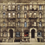
Having looked at the Led Zep album covers, if that's the main artwork available, then without commisioning something totally new, to be fair to Stern they really didn't have a lot to play with! Does look so bad but more a reflection of Lez Zep.
Are they maybe releasing these machines too quickly? How many is that they've released this year? Seems like they're saturating their product.
Are they maybe releasing these machines too quickly? How many is that they've released this year? Seems like they're saturating their product.
I agree with this. Turtles has hardly landed and AIQ was announced. They're doing a bit of a Disney with Star Wars (except the product isn't b0llocks).
I am a semi large fan of Zep. So as I fan, I wasn't expecting much from this pin. Especially not the love that Slash has gave his pin.
Stairway is a song that the band themselves has said is ****.. Its no wonder that Plant hasn't contributed much to it since he has previously said Zep were a glorified boy band. Also, a bit like Metallica, the band doesn't exactly have much in the way of identifying objects.
The track list they have used is great.
I've said it before but with this release it is even more glaring. Stern just need to release a blank game and have several art options to add to it.
This looks a fun game. The lack of middle ramp on the Pro does slow it down a bit.
But this game could easily be anything.
Stick a sword where the zeppelin is and have castle grey skull in the centre that pops up and boom! He-man pin.
I reckon if they can do it with home pins then why not with their regular line
Afraid that’s a poor excuse.Having looked at the Led Zep album covers, if that's the main artwork available, then without commisioning something totally new, to be fair to Stern they really didn't have a lot to play with! Does look so bad but more a reflection of Lez Zep.
Common knowledge the album covers from old are crappy.
They still had Mothership + Celebration day they could have worked with and they could have / should have brought in a decent artist like they did with Met + Luci + Aero.
Only themselves to blame for the schoolboy errors. The crowd are unfortunately upset with the look of all 3, they would have caught a break at least if they looked semi decent but from here I feel it’s an uphill battle.
Edit: Someone at Stern must have thought fans who love LZ music automatically love their album covers as well - huge mistake!
Anyone who collected vinyl years ago will know album art / covers were hit or miss - we were thankful when picture disks were released
I’ve got boat loads of vinyl in my loft of music I love - all metal + rock - some album covers I truly love, some are total w4nk!
Last edited:
As I say, Led Zep before my time and what I have heard since didn;t grab me at all.
Your're right that they should have tried harder and brought someone in to do a decent art job. Does suggest it's been a lazy design all round.
Your're right that they should have tried harder and brought someone in to do a decent art job. Does suggest it's been a lazy design all round.
Do Steve Richie pins suffer more from crap artwork than other pin designers?
Just looking at his recent line up
Game of thrones (so bad they changed the premium play field artwork after the initial release)
Star Wars
Star Trek
Ac/dc
24
I wouldn’t describe any of them as lookers. Ac/Dc is a great game but the giant Angus face . GOT AND SW/ST have a wealth of images that could have been used but the art package was poor.
Black knight 2000 / Spider-Man looked more appealing.
Is it down to licence issues or his personal choice of keeping the playfield uncluttered?
Just looking at his recent line up
Game of thrones (so bad they changed the premium play field artwork after the initial release)
Star Wars
Star Trek
Ac/dc
24
I wouldn’t describe any of them as lookers. Ac/Dc is a great game but the giant Angus face
Black knight 2000 / Spider-Man looked more appealing.
Is it down to licence issues or his personal choice of keeping the playfield uncluttered?
Looking at all 3, they barely deviate, if at all, from the album art.
The only reason I can think of is because Led Zep are notoriously difficult to license from. Aurich gave a good insight into the limitations he had with the Alien art to suggest that the options for Stern may have been very limiting, possibly stopping them from ‘interpreting’ the assets through another artist.
The LE is a really nasty looking game, the Pro might look better in person as the vinyl is pretty cool gatefold album cover, especially with the trippy spinning disc. The Premium needs a different trans light, but is probably the pick of the bunch for it’s simplicity.
i do like the idea of shots changing to match the sections of a song. On the few occasions I completed a song on my MET it was always anticlimactic. I could imagine it being quite a fun way to progress through a game knowing you need to keep going until the chorus to cash in jackpots or get multipliers or something.
I’d like to play one, so I hope a few sell here, even with all the duty shenanigans.
Dubi
Registered
Led Zep are my favourite band so I was looking forward to seeing what they made - mixed thoughts:
* Good choice of songs... missing out Stairway? Well... I dunno, it's the most known but probably doesn't fit so well so fair enough.
* The artwork was also going to be the biggest issue as LZ didn't go for commercial themed marketing like later modern bands... there was never any issue of finding artwork for Aerosmith, IM or GNR, but what could they pick for LZ other than album covers, band photos and "ZOSO" - slim pickings unfortunately
* I like the Pro artwork - worst album, but decent artwork, I think it looks good - don't like how the backglasses are all so similar to the cabinets, but again it's partly down to lack of choice
* Prem - well it's the iconic cover (grainy image and all), but backglass and cab the same? How easy is it to replace a Stern backglass image?
* LE - shocking. As has already been said, why not Mothership which has beautiful artwork (and colours). That LE is just fugly, it's like someone said "how can we appeal to kids too? Oh lets add some bright blue trim"... that Icarus logo isn't even LZ really, it was just their post-prime record label. Terrible choice. I think that Icarus stuff is v popular in USA though for some reason, probably the tasteless gareish colours?
* Like the blade lights. Blimp is quite nice but surely could have been a bit more textured? "ZOSO" side armour is very nice, looks great on the Prem. Topper quite nice but how much? Plunger add-on is meh. Jumping Icarus is crap.
* Playfield... don't know enough about Sterns to know how different it is but seems interesting enough... middle magnet looks good, is that copied from anything else?
I think I'd consider buying a Prem with side armour (+ topper if cheap enough, unlikely tho that is)... do Stern release separate UK versions later or does it require someone to import and adapt the US models? And how long to wait?
I think that's a really good assessment - a man after my own heart.
On artwork, for me - and it may only be peculiar to me - the Lep Zep 1 and Four Sticks have been the most iconic artworks. Of which, if you were to define LZ, why not LZ 1? And whilst it's a photoshopped, unabashed copy, it hits you in the face as Zep.
The disappointment for me is the psychedelic playfield. I have always associated LZ with the mystic and symbolic, not psychedelic, and when I saw the black and white homebrew version I immediately connected, so clearly there are others on the same wavelength (man...).
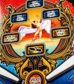
But at least the Prem version calms this down, coupled with the fact that the LZ 1 symbolism (Hindenburg) is actually greater (size-wise) and more prominent in the playfield art and features than the swansong features - large, Hinderburg artwork slap bang in the middle, larger than swan song, and big blimp airship vs tiny, weird swansong man on a stick. This really helps tie in the Prem theme. And I agree, the ZOSO side armour is going to be a nice touch - and much how better than the wedge of powder-coated metal on the LE?
Of course, after GnR,there's a disappointment that the playfield blimps and toys add very little to stye and to the integration. Also, whilst concert footage has been mentioned, I think this is going to be more in the way of how it was used on the Beatles than on GnR.
But like the Beatles game, which I love, this promises to be a good shooter, with interesting code (going by Tim Sexton's commentary) and a good light show; and at risk of being a newbie to the hobby and being terribly exposed, my preference is on how a game shoots and is experienced through the music and lights rather than the blimps and toys, so I shall be joining the queue.
@Pick Holder - so the plan is, having moved the sofa, let's move the Beatles nearer the wall, next to the neighbours, so that I can crank up the LZ. prem.
Peace out.
Last edited:
Better DPI than the Premium cab
Good, bad or ugly I am glad that folks are still making Pins, remember the early noughties when things looked very bleak. Steve Ritchie thought pinball was dead back then.
No such thing as a bad Pin.
I feel older than ever, now, since I remember the early eighties when things were just as bleak, if not more so.
